Banking Reimagined. Banking Redesigned.
The distinct comdirect corporate design
highlights the claim for successful direct banking.

comdirect – Brand Relaunch
Industry
Financial Services
Services
Brand Relaunch
Corporate Design
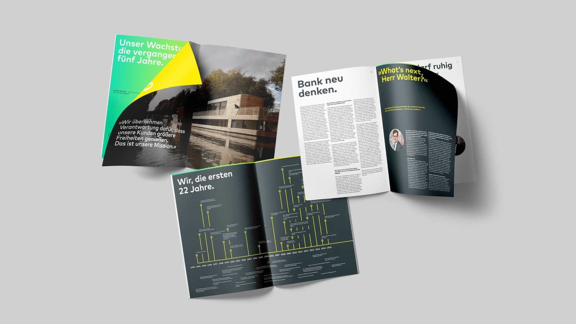
comdirect doesn’t shy away from breaking with old rules and has evolved into a smart financial companion for the modern investor. The concise corporate design expresses exactly that. With a strong and unmistakable cross-media brand presence.

Visual language
Stands out among other banks
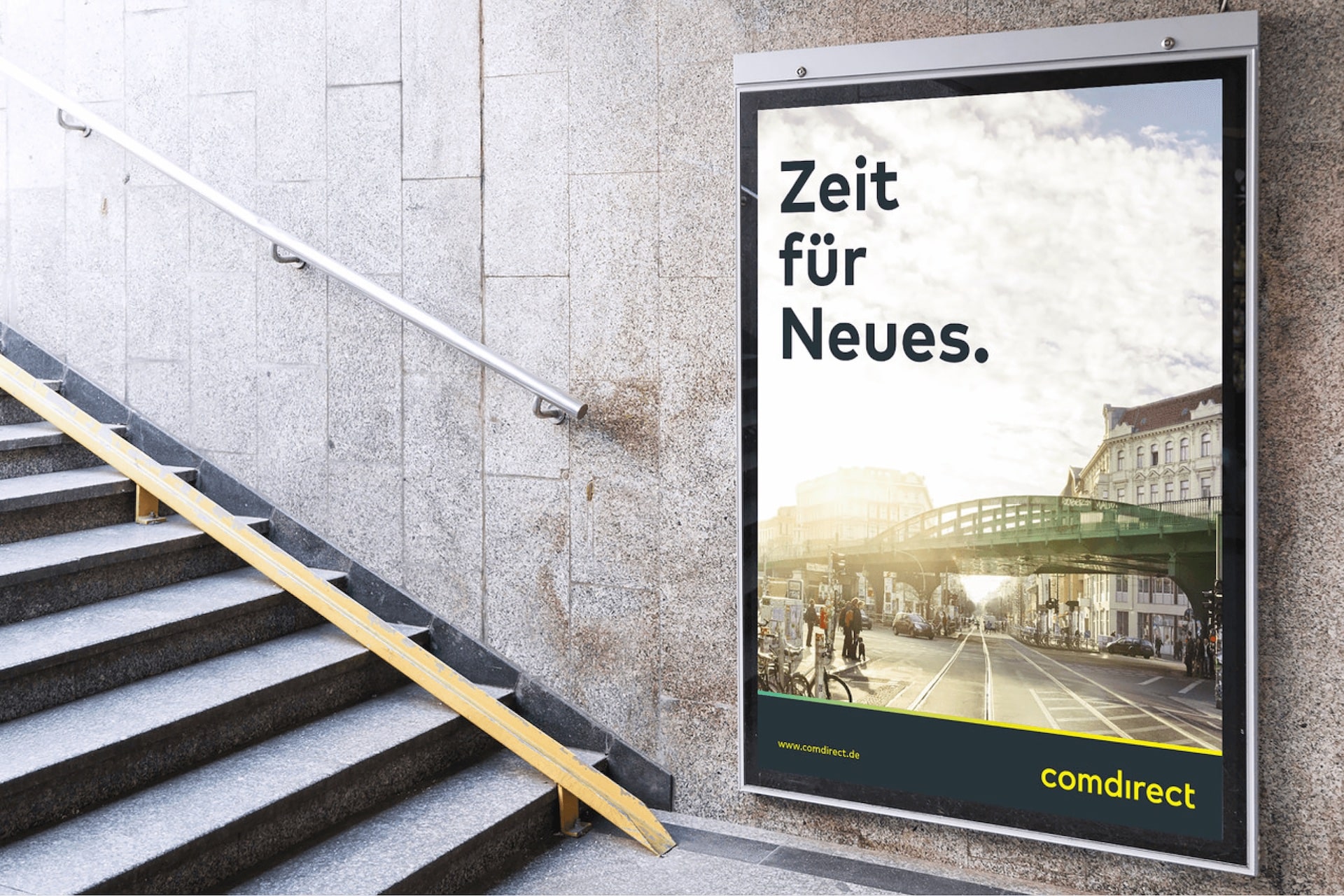
wirDesign developed a creative language for successful direct banking that is not only modern, but also accessible and intuitive. It clearly shows: comdirect stands out among other banks. The new design strengthens comdirect’s company image when it comes to the competition – and at the same time makes the bank even more recognizable and one of a kind.

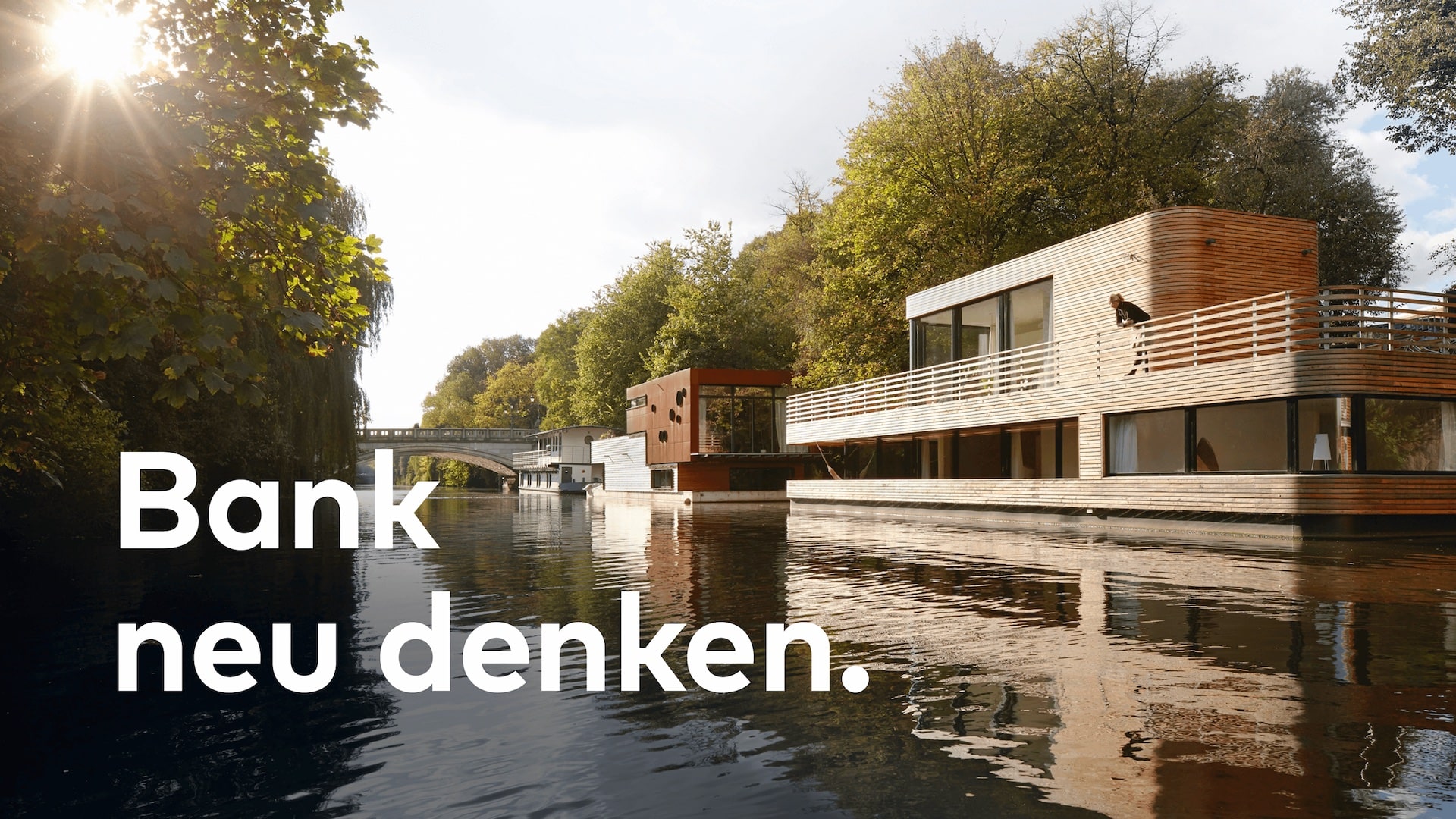
Corporate Design
Digital brand
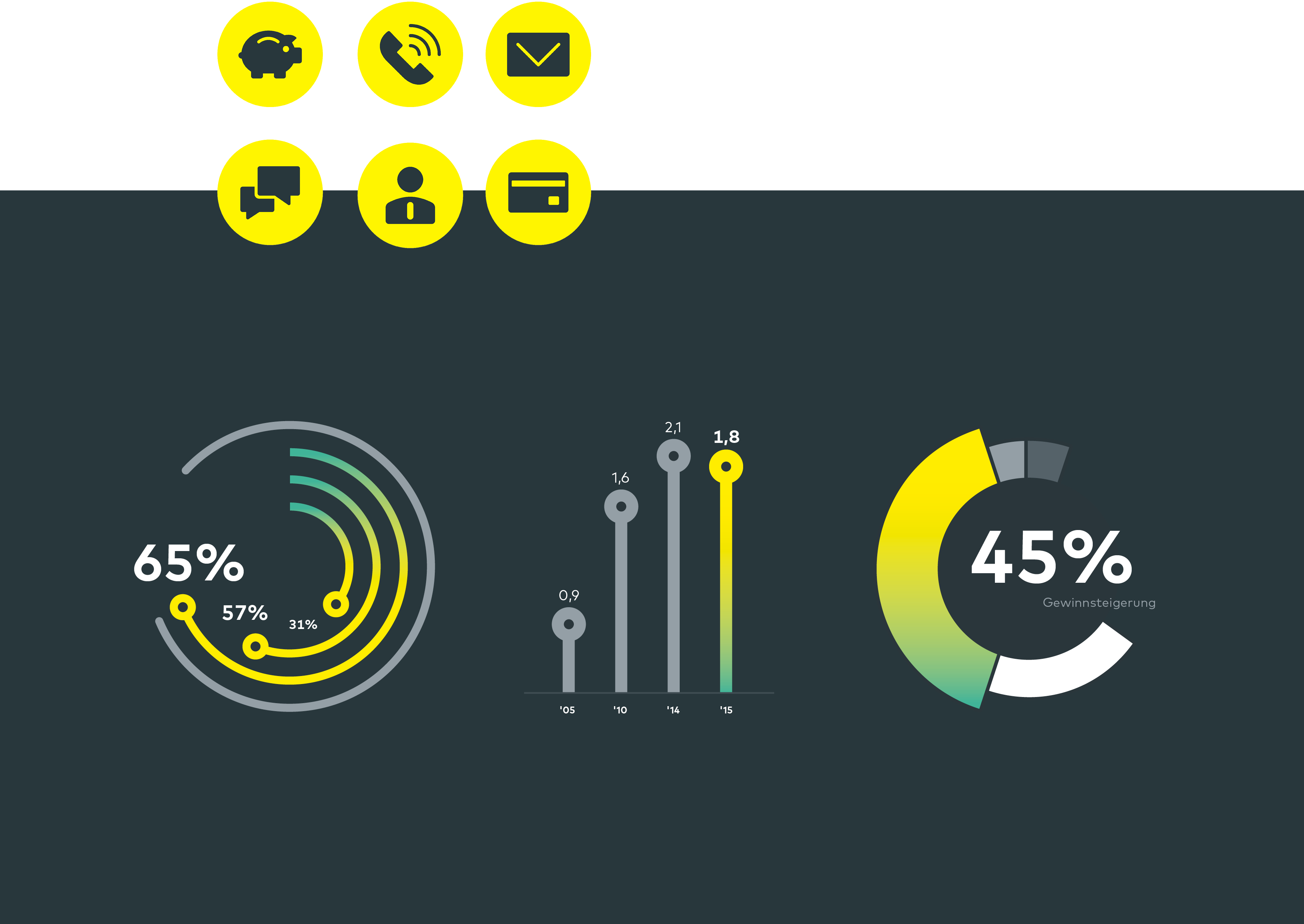
The new look and feel positions comdirect even more strongly as a digital brand and presents the website in a fresh, intuitively comprehensible design. The logo was completely redesigned; typography, colour and image schemes as well as pictograms were newly developed: as modern aesthetic stylistic devices with a special focus on functionality in the online context. Through this, comdirect shows in an impressive way how direct banking cannot only be reimagined, but also redesigned.
