Hannover Re
A new visual identity for one of the largest reinsurers in the world.
/Hannover%20Re/Supersign-intro-1.png)
Hannover Re – Corporate Design Development
Industry sector
Insurance
Services
Optimization of word mark
Development of figurative mark
& design of brand codes
Design principle
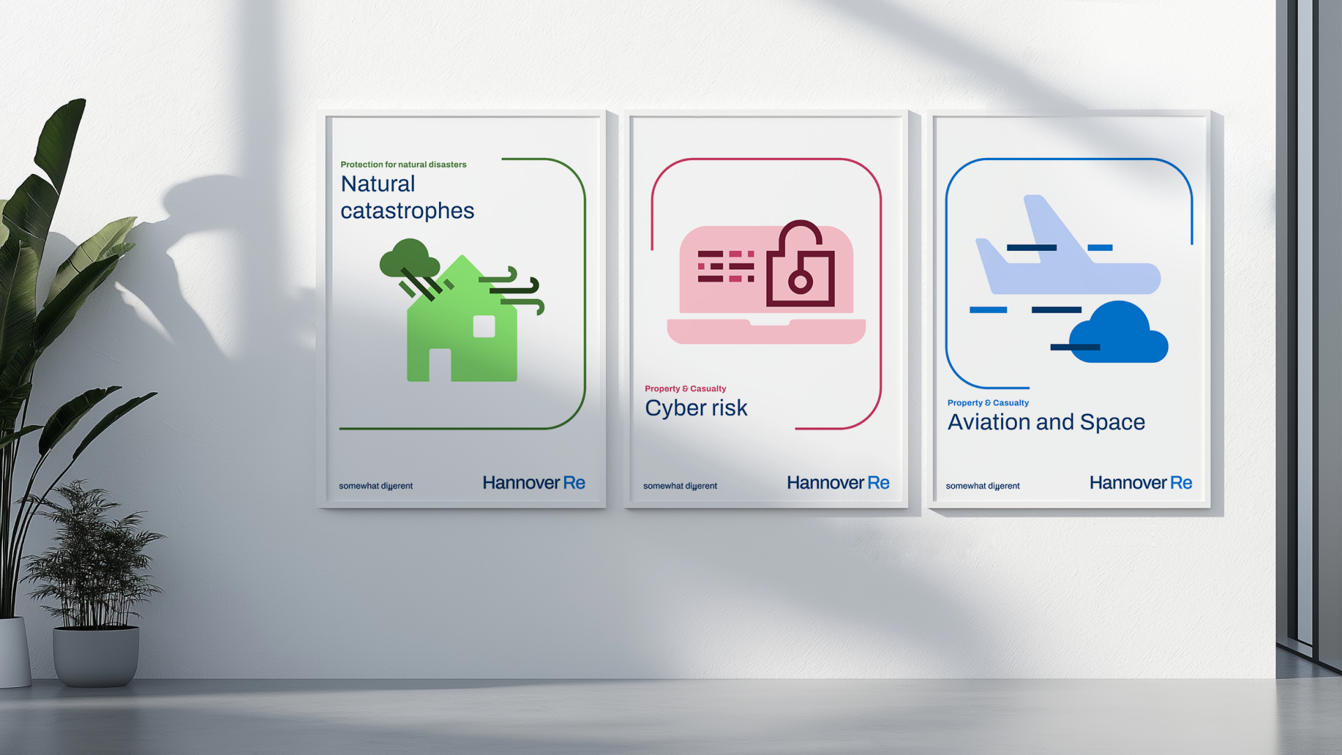
Icon style and library
Brand portal and guidelines
Visual communication and
Design of touchpoints
Corporate and career website
Employer branding
Hannover Re is an internationally active reinsurer headquartered in Hanover. It supports insurance companies worldwide in hedging risks and minimizing financial losses by assuming part of these risks.
In a process that lasted over two years, we worked with the Hannover Re team to review and gradually strengthen the brand's visual identity. The result is a new, consistent image that gives Hannover Re a new radiance across all touchpoints.
At the heart of this visual identity is the so-called “Supersign” – a concise symbol that sums up and visualizes the brand idea “Team up to create opportunities”.
brand idea
Beyond risk sharing,
we team up
to create opportunities
»The new design is much more than just an update of our corporate identity, it reflects all our fundamental values and makes Hannover Re’s DNA visible. Although a lot has changed, we remain #somewhatdifferent.«
Cornelia Demmel, Managing Director Global Human Resources & Corporate Communications Hannover Re
Design principle
The whole is more than the sum of its parts.
Only by working together, the right solutions for the challenges of tomorrow can be found. The lines and shapes – as the smallest units of our new corporate design – interact with each other and create synergies. A visual symbol for the interconnected nature of our work.
Picture style
human
unconventional
radiant
/Hannover%20Re/Claim.png)
/Hannover%20Re/claim-detail.png)
»The strong foundation of our brand also determines the new approach of our corporate design. Elements that interact and work together to create synergies. We believe that the right solutions for the challenges of tomorrow can only be found together – our new brand design reflects this aspiration.«
Denise Eichhorn, Team Manager Communications Hannover Re
/Hannover%20Re/jute.png)
/Hannover%20Re/notebook.png)
/Hannover%20Re/podcast.png)
/Hannover%20Re/flag.png)
Design themes
A blue brand with colorful accents.
/Hannover%20Re/mood-1.jpg)

/Hannover%20Re/postings.png)
/Hannover%20Re/Mask%20group.jpg)
digital design system
From atom to molecule
We have developed a digital design system for Hannover Re that is implemented consistently across all digital touchpoints, especially on the website, thus ensuring a uniform, strong brand presence.
/Hannover%20Re/locations-web.jpg)
/Hannover%20Re/Web-Mood-2.png)
/Hannover%20Re/Web-Mood-3.png)
brand management
Make tools, not rules.
Tools in the brand portal support users in using the corporate design and applying the design. Functions such as a Teams background creator, a vCard creator or a portrait photo creator help to apply the corporate design in a playful way and bring it into the company.
/Hannover%20Re/Markenportal-on-couch.jpg)
/Hannover%20Re/Tool-1.png)
/Hannover%20Re/Tool-2.png)
/Hannover%20Re/Tool-3.png)
/Hannover%20Re/Tool-4.png)
/Hannover%20Re/Tool-5.png)
/Hannover%20Re/Tool-6.png)
/Hannover%20Re/Tool-7.jpg)
/Hannover%20Re/Tool-8.png)
»To find the right solutions for future challenges, you need the right partner: we have found one for our brand in wirDesign. Active exchange, creativity, enthusiasm and a focus on solutions have characterized our collaboration from day one. The result speaks for itself – many thanks to the great wirDesign team!«
Berit Jänisch, Senior Corporate Brand Consultant Hannover Re


